Curated OER
How Do You Use a Scatter Plot to Find a Positive Correlation?
You can use a scatter plot to determine if there is a positive, negative, or no correlation between the given data. After graphing data you need to find a line of fit, a line that best represents the data you've graphed. It will be the...
Curated OER
How Do You Use a Scatter Plot to Find a Negative Correlation?
Organize your data on a graph. Use the data, pair them up as coordinate pairs, then graph them, resulting in a scatter plot. But how, you ask? Watch this tutorial to learn the step-by-step process needed to draw a scatter plot and...
Curated OER
How Do You Make a Scatter Plot?
So you've got some x-values and some y-values and you want to make a scatter plot. First thing is to make a table for your x and y values. Then make ordered pairs and you can plot them.
Curated OER
How Do You Make a Scatter Plot?
So you've got some x-values and some y-values and you want to make a scatter plot. First thing is to make a table for your x and y values. Then make ordered pairs and you can plot them.
Curated OER
How Do You Use a Scatter Plot to Find No Correlation?
How do you determine the correlation in a set of data? Plot the data, find the line of fit, then use that line to determine if the correlation is positive, negative, or no correlation. This tutorial demonstrates that when a line of fit...
Curated OER
Scatter Plots and Trends - Math Help
Introduce learners to the use and function of a scatter plot. Using the example of a how many traffic tickets a woman received in a ten year period, the tutor explains how to create the scatter plot, label the x and y axis, and plot...
Khan Academy
Fitting a Line to Data, Regression, Probability and Statistics
Sal trades his tablet for an Excel spreadsheet in this video, which covers fitting data to a line. Using a word problem about median income, he not only solves the problem but also demonstrates how to use scatter plots and Excel tools in...
Corbett Maths
Scatter Graphs
No scatter brains here—only graphs! A thorough video lesson begins by describing the process of plotting data to create a scatter plot. The instructor goes on to explain how to draw a line of best fit and then use it to make some...
Flipped Math
Create and Analyze Graphs
Model the world with graphs. Pupils watch and participate in creating graphs to model real-world situations. The presenters stress the importance of a consistent scale and proper labels for the graphs along with identification of the...
Corbett Maths
Scatter Graphs: Correlation
How does understanding correlate with instruction? A systematic lesson describes the different types of correlation as well as how to determine the strength of the correlation. After watching the video, learners complete practice...
Bozeman Science
Graphing Data By Hand
We have calculators, so why do we have to do this by hand? The video takes viewers through graphing scientific data by hand to create a scatter plot. The process includes labeling axes, writing an appropriate title, determining a...
Flipped Math
Best Fit Lines
What fits best? Pupils watch a video that reviews creating a scatter plot. Learners develop an understanding of correlation and determine whether it is moderate, strong, or none as well as positive or negative. Finally, they use a...
Corbett Maths
Drawing Conversion Graphs
A conversion graph makes quick work of determining unit conversions. A video lesson demonstrates how to create and use a conversion graph. Learners then demonstrate their understanding with provided practice problems.
Crash Course
Correlation Doesn't Equal Causation: Crash Course Statistics #8
There's likely a strong correlation between watching the video and learning about causation. Scholars hear about different types of correlation and correlation coefficients through the informative YouTube video. They also see how...
National Education Association
Use Coordinate Geometry to Represent and/or Solve Problems
A geometry video explains how to solve for midpoint, length of a line, and use the Pythagorean Theorem. It includes multiple guided practice problems for all three equations.
Curated OER
Solving Equations
A mathematics video explains the parts of an equation and reviewing relevant vocabulary. Next, it covers one-, two-, and multi-step equations. It includes a few example problems for each type as well.
National Education Association
Interpret The Rate of Change (Slope) and Intercepts Within The Context of Everyday Life
I'll do algebra, but graphing is where I draw the line! Video explains how to find the slope of a line when starting with word problems. It includes positive and negative slopes as well as how to identify intercepts.
National Education Association
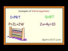
Solve Linear Formulas and Literal Equations for a Specified Variable
Mathematics is not a spectator sport. A video explains how to identify literal equations and why pupils will need to use them. It goes on to describe how to solve for a specified variable.
National Education Association
Identifying Variables: Independent and Dependent
Why did the variable add its opposite? To get to the other side. A video introduces the concept of variables. It compares and contrasts independent and dependent variables in a variety of problems.
National Education Association
Determine Minimum, Maximum, Vertex, and Zeros Given the Graph
Do not always be maxed out by the vertex. A short video introduces the graphical display of the vertex and zeros of a quadratic function. The presenter provides the definitions of the minimum and maximum of the graph along with...
National Education Association
Solve and Graph Simple Absolute Value Equations and Inequalities
What is the best method to overcome negativity? Remember your absolute value! An informative video starts with an explanation of what absolute value is and its connection to measurement. It goes on to solve sample problems to help...
National Education Association
Using Measures of Central Tendency
Is it better to be average or an outlier? It all depends on your perspective! The video explains the impact an outlier has on central tendency. Using multiple examples to solve for mean, median, and mode, the video proves that having an...
Sophia Learning
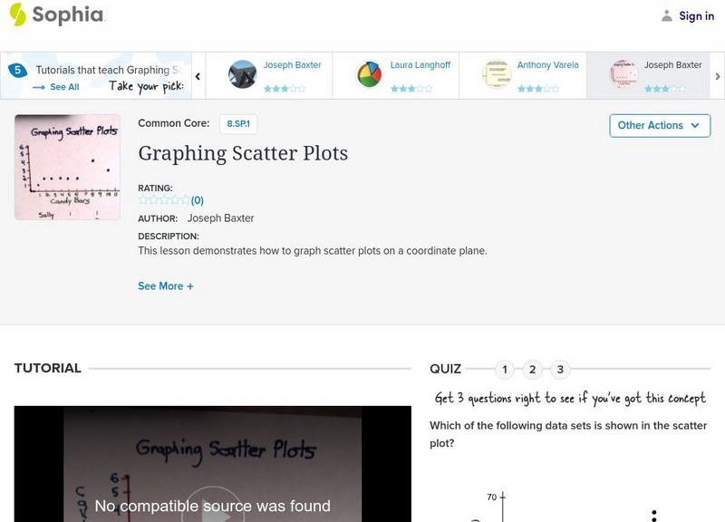
Sophia: Graphing Scatter Plots
Create a scatter plot by displaying data on a coordinate plane. Assess understanding with a quiz.
Loyola University Chicago
Math Flix: Graphs: Scatter Plot Decoding
This QuickTime movie provides an opportunity to create a data table by analyzing a scatter plot. As you watch and listen to the teacher and student interact it helps clarify the thinking behind applying this concept.


