Hi, what do you want to do?
Howard Hughes Medical Institute
Spreadsheet Tutorial 5: Histogram
A professional-looking histogram is just a few clicks away. The last installment of a five-part Spreadsheet Data Analysis series focuses on histograms. Learners work through a tutorial to see how spreadsheets can help make frequency...
Curated OER
Music and Sports
With so much talent in the classroom, do your musicians and athletes have related interests? This problem has your learners taking data from their classmates to decide whether there is an association between the two activities. The...
Howard Hughes Medical Institute
Patterns in the Distribution of Lactase Persistence
We all drink milk as babies, so why can't we all drink it as adults? Examine the trend in lactase production on the world-wide scale as science scholars analyze and interpret data. Groups create pie charts from the data, place them on a...
Howard Hughes Medical Institute
Developing an Explanation for Mouse Fur Color
Whether or not you think mice are nice, you'll love the colorful activity! Scholars examine evidence for evolution in the rock pocket mouse through video, discussion, and collaborative work. Learners watch a video regarding variation in...
Oswego City School District
Regents Exam Prep Center: Practice With Organizing and Interpreting Data
Several problems are presented to test your skills in creating and interpreting frequency tables, pie charts, box-and-whisker and stem-and-leaf plots.
Texas Instruments
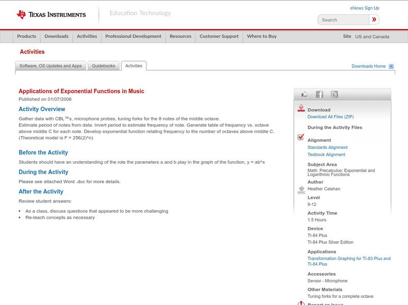
Texas Instruments: Applications of Exponential Functions in Music
In this lesson students will gather data on various tones and estimate frequency while creating a table of frequency vs. octave.


