Hi, what do you want to do?
PBS
Career Connections | Bookkeeping and Accounting
Keeping track of the finances is the job of the accountant and the bookkeeper. Find out what skills add up to make it in the world of ledgers and numbers.
Flipped Math
Comparing Distributions
Here's a lesson that is beyond compare. Young mathematicians learn to compare data distributions in the fourth of five installments in Algebra 1 Unit 4. They consider the shape of the distributions, identify any outliers, and compare the...
Flipped Math
Data Distributions
The shape of a data distribution can help shape one's understanding of the data. The second of five lessons in Algebra 1 Unit 4 focuses on data distributions. By watching a video, scholars learn about symmetric, bimodal, and skewed...
National Education Association
Using Measures of Central Tendency
Is it better to be average or an outlier? It all depends on your perspective! The video explains the impact an outlier has on central tendency. Using multiple examples to solve for mean, median, and mode, the video proves that having an...
Virtual Nerd
Virtual Nerd: How Do You Use a Scatter Plot to Find a Line of Fit
In this video lesson students learn how to graph data on a coordinate plane and draw a line of fit for that data.
Annenberg Foundation
Annenberg Learner: Against All Odds: Histograms
Meteorologists use histograms to map when lightning strikes and this visualization technique helps them understand the data in new ways. [9:42]
Virtual Nerd
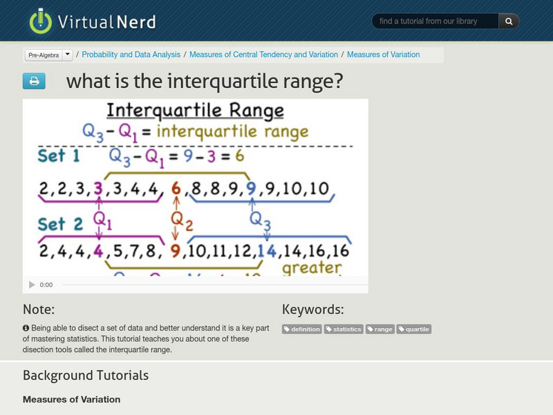
Virtual Nerd: What Is the Interquartile Range?
This tutorial teaches about one of the ways to dissect a set of data called the interquartile range. [4:34]
Imagine Learning Classroom
Learn Zillion: Lesson Video for 'Understand the Effect of Outliers on Shape'
In this lesson, you will learn how outliers affect shape and measures of center and spread by comparing their impact to what you already know about the effect of skewness. [7:20]
Virtual Nerd
Virtual Nerd: How Do You Use a Scatter Plot to Find No Correlation?
This tutorial takes you through the steps of creating a scatter plot, drawing a line-of-fit, and determining the correlation if any. [1:40]
Virtual Nerd
Virtual Nerd: How Do You Use a Scatter Plot to Find a Positive Correlation?
This tutorial takes you through the steps of creating a scatter plot, drawing a line-of-fit, and determining the correlation if any. [1:53]
Virtual Nerd
Virtual Nerd: How Do You Use a Scatter Plot to Find a Negative Correlation?
This tutorial takes you through the steps of creating a scatter plot, drawing a line-of-fit, and determining if there is any correlation. [1:56]
Khan Academy
Khan Academy: Estimating the Line of Best Fit
In this video lesson, students estimate the line of best fit from a scatter plot. [1:16]
Khan Academy
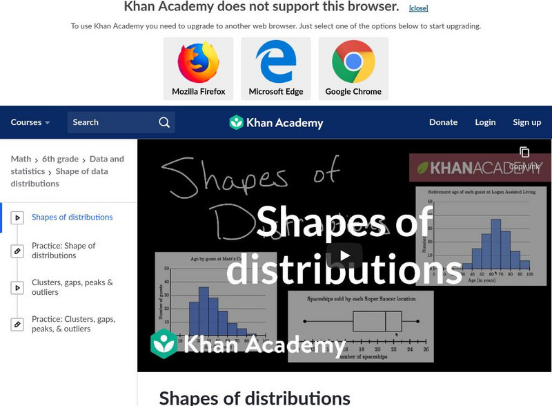
Khan Academy: Shapes of Distributions
This video discusses how to interpret a data display by looking at patterns and anomolies in the shape of its distribution. [5:06]
Khan Academy
Khan Academy: Box and Whisker Plots: Constructing a Box and Whisker Plot
Constructing a box and whisker plot to analyze data.
Sophia Learning
Sophia: Z Scores
In this lesson, students are introduced to Z-scores and their relevance to variance and distribution in data sets.
Sophia Learning
Sophia: Some Statistical Terms #2
This lesson will define the terms quartile, lower quartile, upper quartile, and interquartile range.
Sophia Learning
Sophia: Interpreting Box and Whisker Plots
This video lesson demonstrates how to interpret box-and-whisker plots to find outliers.


