Hi, what do you want to do?
National Council of Teachers of Mathematics
Nctm: Illuminations: State Data Map
Data can be displayed in a variety of ways. This interactive map of the United States shows data by degrees of color. Choose to display data such as: land area, population, population density, gas use, and much more.
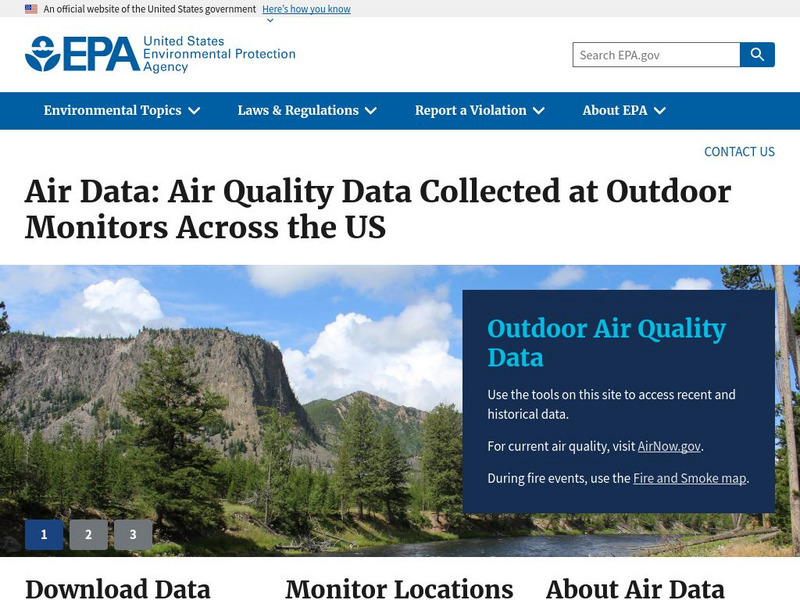
US Environmental Protection Agency
Epa: Air Data
The AirData website gives you access to air quality data collected at outdoor monitors across the United States, Puerto Rico, and the U. S. Virgin Islands. The data comes primarily from the AQS (Air Quality System) database. You can...
CK-12 Foundation
Ck 12: Statistics: Displaying Categorical Variables
[Free Registration/Login may be required to access all resource tools.] This Concept covers a few ways in which categorical data can be displayed; using bar graphs and pie graphs.
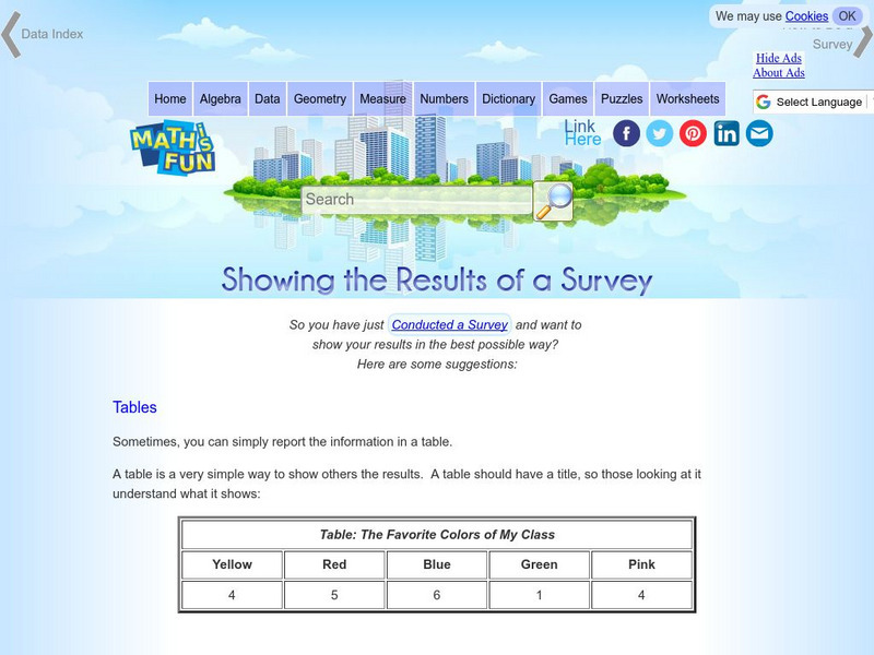
Math Is Fun
Math Is Fun: Showing the Results of a Survey
A variety of ways to display the results of a survey are listed, including tables, statistics and different types of graphs.
TED Talks
Ted: Ted Ed: Hans Rosling Shows the Best Stats You've Ever Seen
Explore collected data in regards to life expectancies, family size, and finances through out the world and the various ways the data has been displayed.
TeachEngineering
Teach Engineering: Spectroscopy
Students learn how using a spectrograph helps us understand the composition of light sources. Using simple materials and holographic diffraction gratings (available online at a variety of sites, including Edmund Scientifics and the...
Google
Google Maps: Virtual Tour of Pergamon Museum, Berlin
Take a virtual tour through the Pergamon Museum located on Museum Island in Berlin. This world famous museum has life-size, reconstructed monuments from ancient civilizations, including the Pergamon Altar of Zeus, the Roman Market Gate...


