Hi, what do you want to do?
Math Graphs
Houghton Mifflin: Math Graphs: Slope of a Tangent Line 1 [Pdf]
Students use the given graph to estimate the slope of a tangent line. The resource consists of an enlarged printable version of a math graph available in PDF format.
Math Graphs
Houghton Mifflin: Math Graphs: Slope of a Tangent Line 2 [Pdf]
Learners use the given graph to estimate the slope of a tangent line. The resource consists of an enlarged printable version of a math graph available in PDF format.
Math Graphs
Houghton Mifflin: Math Graphs: Slope of a Tangent Line 3 [Pdf]
Students use the given graph to estimate the slope of a tangent line. The resource consists of an enlarged printable version of a math graph available in PDF format.
Math Graphs
Houghton Mifflin: Math Graphs: Slope of a Tangent Line 4 [Pdf]
Students use the given graph to estimate the slope of a tangent line. The resource consists of an enlarged printable version of a math graph available in PDF format.
McGraw Hill
Glencoe: Using Graphs to Understand Data Quiz
This is a quiz with five quick questions to check your knowledge of how to use graphs to understand data. It is self-checking.
Science Education Resource Center at Carleton College
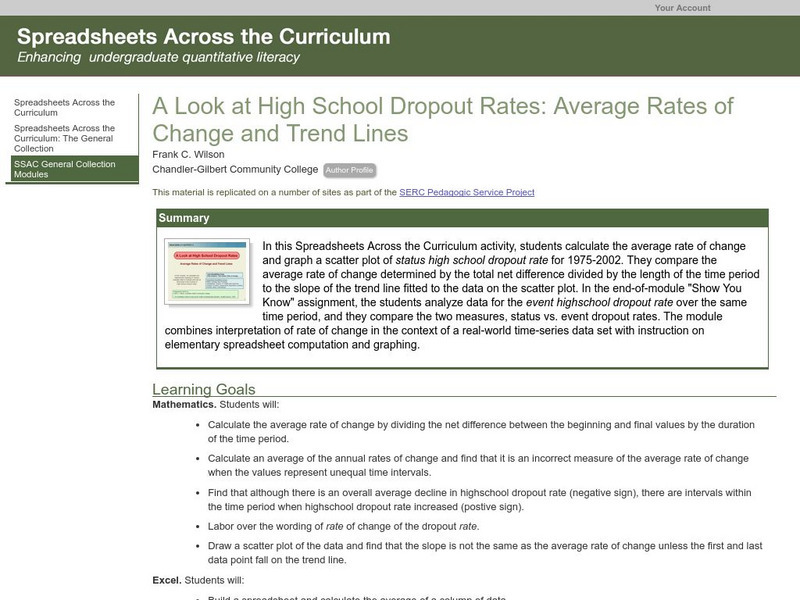
Serc: Average Rates of Change and Trend Lines
In this Spreadsheets Across the Curriculum activity, students calculate the average rate of change and graph a scatter plot of status high school dropout rate for 1975-2002. The module combines interpretation of rate of change in the...
Texas Instruments
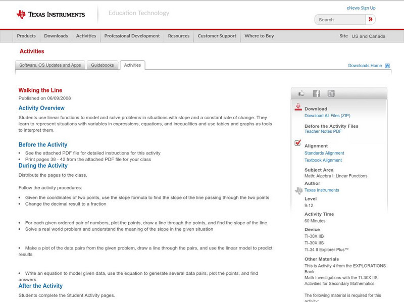
Texas Instruments: Walking the Line
In this activity, students use linear functions to model and solve problems in situations with slope and a constant rate of change. They learn to represent situations with variables in expressions, equations, and inequalities and use...
Math Graphs
Houghton Mifflin: Math Graphs: Average Rate of Change 1 [Pdf]
Students use the graph of "f" to determine the average rate of change and sketch a tangent line. The problem is available in PDF format.
Math Graphs
Houghton Mifflin: Math Graphs: Slope of a Tangent Line 5 [Pdf]
Learners estimate the slope of the tangent line and verify their answer analytically. The graph is available in PDF format.
Math Graphs
Houghton Mifflin: Math Graphs: Slope of a Tangent Line 6 [Pdf]
Learners estimate the slope of the tangent line and verify their answer analytically. The graph is available in PDF format.
Math Graphs
Houghton Mifflin: Math Graphs: Slope of a Tangent Line 7 [Pdf]
The resource has students estimate the slope of the tangent line at a given point. The graph is available in PDF format.
Math Graphs
Houghton Mifflin: Math Graphs: Slope of a Tangent Line 8 [Pdf]
The resource has students estimate the slope of the tangent line at a given point. The graph is available in PDF format.
Math Graphs
Houghton Mifflin: Math Graphs: Slope of a Tangent Line 9 [Pdf]
Learners examine the concept of a slope related to differential calculus. The math graph is available in PDF format.
Math Graphs
Houghton Mifflin: Math Graphs: Slope of a Tangent Line 10 [Pdf]
Learners examine the concept of a slope related to differential calculus. The math graph is available in PDF format.
Math Graphs
Houghton Mifflin: Math Graphs: Slope of a Tangent Line 11 [Pdf]
Students estimate the derivative of the function at a point. The function graph is available in PDF format.
Math Graphs
Houghton Mifflin: Math Graphs: Slope of a Tangent Line 12 [Pdf]
Students estimate the derivative of the function at a point. The function graph is available in PDF format.
Math Graphs
Houghton Mifflin: Math Graphs: Slope of a Tangent Line 13 [Pdf]
The handout has students estimate the rate of change of the function at a given point. The exercise consists of a graph available in PDF format.
Math Graphs
Houghton Mifflin: Math Graphs: Slope of a Tangent Line 14 [Pdf]
The handout has students estimate the rate of change of the function at a given point. The handout consists of a graph available in PDF format.
Math Graphs
Houghton Mifflin: Math Graphs: Slope of a Tangent Line 15 [Pdf]
The practice problem compares finding the slope of the tangent line graphically and analytically. The handout is available in PDF format.
Math Graphs
Houghton Mifflin: Math Graphs: Slope of a Tangent Line 16 [Pdf]
The practice problem compares finding the slope of the tangent line graphically and analytically. The handout is available in PDF format.
PBS
Pbs: The Lowdown: What You Need to Know About Immigration Reform
Interpret graphs showing changes over time in the percentage of foreign-born US residents and in annual deportations in this interactive from KQED. In the accompanying classroom activity, students use the interactive and look at how...
Science Education Resource Center at Carleton College
Serc: Mineral Density: Teaching Accuracy, Slope, and Percent Error
Students explore the meaning of density and use their math skills to graph mass/volume data, write an equation for a line, and interpret the slope of the line. Students also find the density of two unknown mineral samples and use those...
Khan Academy
Khan Academy: Coordinate Plane Problems in All Four Quadrants
Practice solving word problems by interpreting the meaning of points plotted on an xy coordinate system. Students receive immediate feedback and have the opportunity to try questions repeatedly, watch a video or receive hints.
Khan Academy
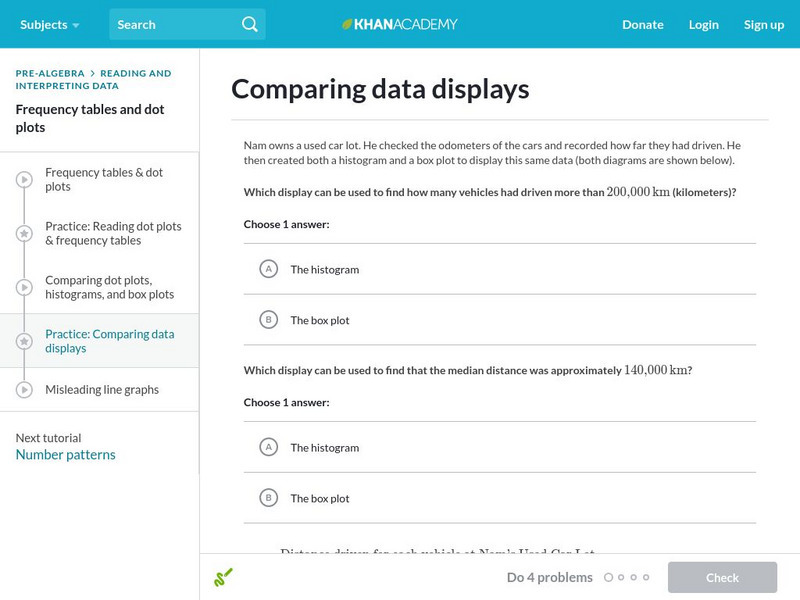
Khan Academy: Comparing Data Displays
Practice interpreting and comparing dot plots, histograms, and box plots. Students receive immediate feedback and have the opportunity to try questions repeatedly, watch a video or receive hints.


![Houghton Mifflin: Math Graphs: Slope of a Tangent Line 1 [Pdf] Unknown Type Houghton Mifflin: Math Graphs: Slope of a Tangent Line 1 [Pdf] Unknown Type](https://static.lp.lexp.cloud/images/attachment_defaults/resource/large/FPO-knovation.png)


