Hi, what do you want to do?
Curated OER
Mechanical Energy
Students discover the difference between kinetic and potential energy in an experiment using toy cars and tracks. In small groups, they set up the experiment to determine the distance milk cartons will travel when hit by toy car. They...
Concord Consortium
Concord Consortium: Smartgraphs: Graphs Tell a Story
Students match a word story to the correct set of graphs involving temperature change over time.
CK-12 Foundation
Ck 12: Statistics: Line Graphs to Display Data Over Time
[Free Registration/Login may be required to access all resource tools.] Create line graphs to display how data changes over time.
Better Lesson
Better Lesson: Line Me Up. Analyzing and Creating Line Graphs
Line graphs are used in our daily lives to show change over time.
University of Minnesota
U Mn: Gender Ratios in Global Migration: Men Who Migrate, Women Who Wait?
This resource uses a text and graph to show how the gender ratio of international migrants - the proportion of male to female migrants - has changed over time. Its goal is to stimulate thinking about shifting gender ratios in global...
Other
Bucks County Community College: Visual Organizers
This site walks you through the benefits of visual organizers, and focuses on a variety of types: tables, charts, graphs, timelines, flowcharts, diagrams, and webs.
University Corporation for Atmospheric Research
Ucar: Introduction to Climate
A detailed overview of the Earth's climate, with explanations about the difference between weather and climate, dendrochronology, palynology, and how Earth's climate has changed over time. All information is reinforced through pictures,...
The Math League
The Math League: Using Data and Statistics
This site contains two short examples of line graphs, charts that show change over time. This is a quick introduction to the topic of statistical graphing.
PBS
Pbs: The Lowdown: What You Need to Know About Immigration Reform
Interpret graphs showing changes over time in the percentage of foreign-born US residents and in annual deportations in this interactive from KQED. In the accompanying classroom activity, students use the interactive and look at how...
PBS
Pbs: The Lowdown: Poverty Trends: What Does It Mean to Be Poor in America?
Use math to learn about changes in US wealth distribution and poverty rate over time in this interactive from KQED. In the accompanying classroom activity, students interpret the graphs and consider how the poverty rate spike following...
Texas Instruments
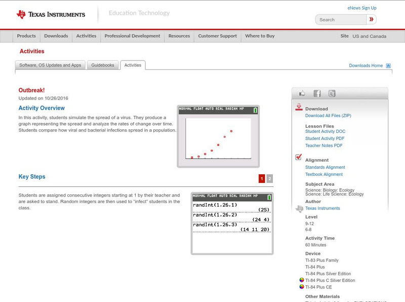
Texas Instruments: Outbreak!
In this activity, students simulate the spread of a virus. They produce a graph representing the spread and analyze the rates of change over time. Students compare how viral and bacterial infections spread in a population.
PBS
Pbs: The Lowdown: Made in America: The High Cost of Fashion
Investigate data on changes over time in where our apparel is made and how much we spend on it in these images from KQED. In the accompanying classroom activity, students use the interactive and graph the data. They also look for...
TeachEngineering
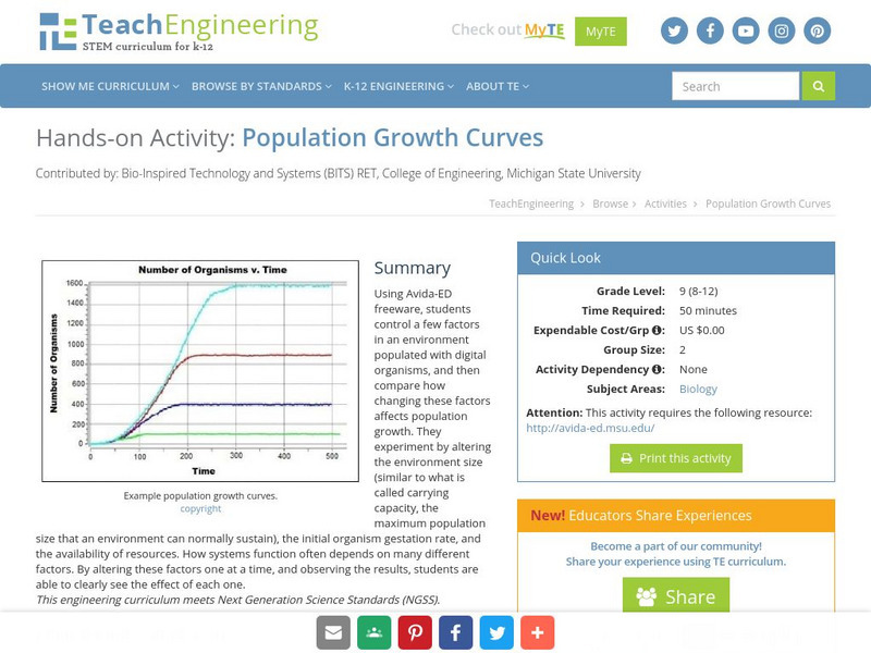
Teach Engineering: Population Growth Curves
Using Avida-ED freeware, students control a few factors in an environment populated with digital organisms, and then compare how changing these factors affects population growth. They experiment by altering the environment size (similar...
TeachEngineering
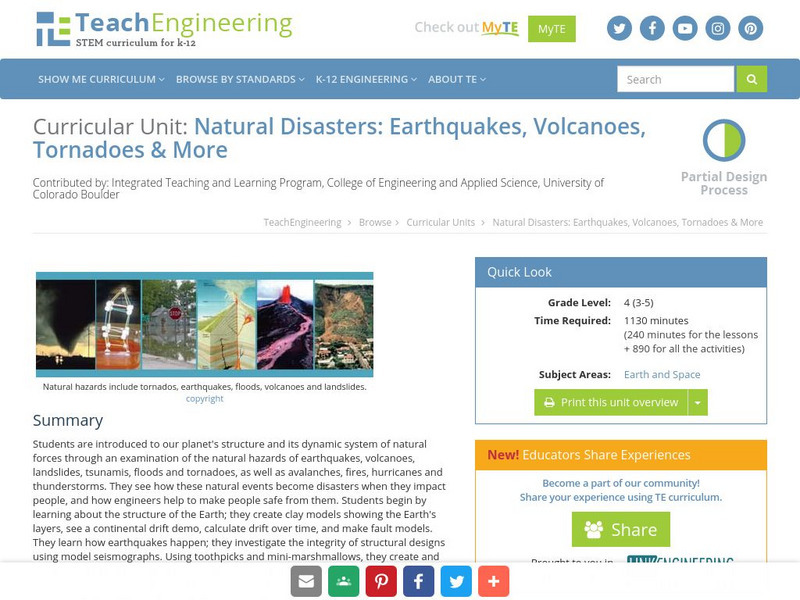
Teach Engineering: Natural Disasters
Students are introduced to our planet's structure and its dynamic system of natural forces through an examination of the natural hazards of earthquakes, volcanoes, landslides, tsunamis, floods and tornados, as well as avalanches, fires,...
NASA
Nasa: Sea Surface Temperature Trends of the Gulf Stream
Students investigate changes in the surface temperatures of the Gulf Stream over the course of the seasons using data collected by NASA's satellites. The data is inputted into a spreadsheet and graphed.
US Department of Education
Nces: How to Create a Pie Chart
Resource from the National Center for Education Statistics provides tools and steps for creating printable pie charts online. Fill in the information, click the necessary buttons, and you have created a pie chart!
TeachEngineering
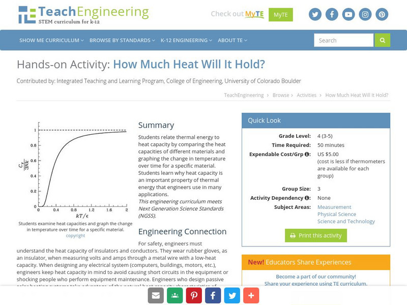
Teach Engineering: How Much Heat Will It Hold?
Students relate thermal energy to heat capacity by comparing the heat capacities of different materials and graphing the change in temperature over time for a specific material. Students learn why heat capacity is an important property...
Sophia Learning
Sophia: Algebra I: Exponential Growth and Decay
A webpage containing notes explaining that exponential growth and decay show the change of a quantity over time. Notes give equation and graphs for exponential growth and decay.


