Loyola University Chicago
Math Flix: Graphs: Scatter Plot Decoding
This QuickTime movie provides an opportunity to create a data table by analyzing a scatter plot. As you watch and listen to the teacher and student interact it helps clarify the thinking behind applying this concept.
Virtual Nerd
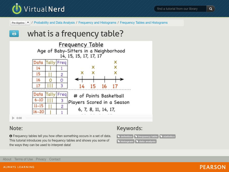
Virtual Nerd: What Is a Frequency Table?
Video serves as an introduction to frequency tables which tell you how often something occurs in a set of data. [6:44]
Texas Education Agency
Texas Gateway: Generalizability of Results and Conclusions
This video discusses how to determine whether the results of a statistical experiment can be generalized to a larger population. Includes downloadable study guide with exercises - guide also covers other topics. [5:07]
Loyola University Chicago
Math Flix: Data Analysis Statistical Analysis With Words
From the MathFLIX Series, this Quick-Time movie builds on student knowledge of the concepts of mean, median, and mode. In this interactive discussion, teacher and student go step by step through the data analysis process to identify...
PBS
Pbs Learning Media: Traffic Jam Part 5: Make a Model
Students process and analyze data on traffic light congestion. This is part of a 7-part engineering design lesson. [3:31]
Other
Qlik: Understanding Data
This course is designed to help users gain an understanding of Data, learn about different types and attributes of data, and help them understand why this information is important in the world today. Includes two videos (25 min....
Khan Academy
Khan Academy: Center, Spread, and Shape of Distributions Harder Example
The resource from Khan Academy provides practice questions for the SAT. Watch Sal work through a harder Center, spread, and shape of distributions problem.
Sophia Learning
Sophia: Writing a Data Summary: Lesson 4
In this lesson, students see how to write a summary based on a set of data. It is 4 of 6 in the series titled "Writing a Data Summary." Includes short quiz. [3:33]
Bozeman Science
Bozeman Science: Apb Practice 5 Analysis & Evaluation of Evidence
In this video, Paul Andersen explains how scientists analyze data and evaluate evidence. He starts with a description of data and how it must be properly displayed. He then describes types of data in each of the four big ideas. He...
Loyola University Chicago
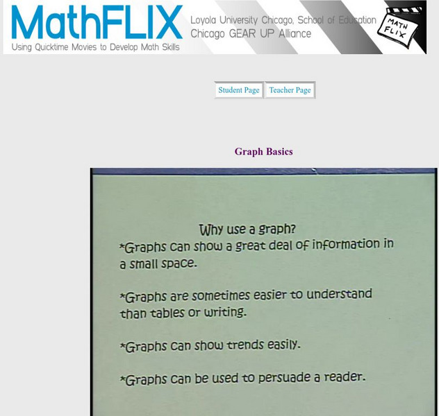
Math Flix: Graphs: Basics
This QuickTime movie reviews basic concepts for graphs. As you watch and listen to the teacher and student interact it helps clarify the thinking behind applying this concept.
Loyola University Chicago
Math Flix: Graphs: Reading Circle Graphs
This QuickTime movie provides an opportunity to practice reading circle graphs. A pdf worksheet is available by clicking on the hyperlink at the bottom of the page. As you watch and listen to the teacher and student interact it helps...
Loyola University Chicago
Math Flix: Graphs: Bar Graph Histograms
This QuickTime movie introduces a specific type of bar graph called histograms. As you watch and listen to the teacher and student interact it helps clarify the thinking behind applying this concept.


